News
Responsive Logo Design

There’s no doubt today’s logos have to work harder than they used to—in the past, a logo was simply intended for shop signs and newspaper ads. With the advent and growing popularity of responsive web design, however, modern logos now have to work on a vast number of screen sizes and resolutions.
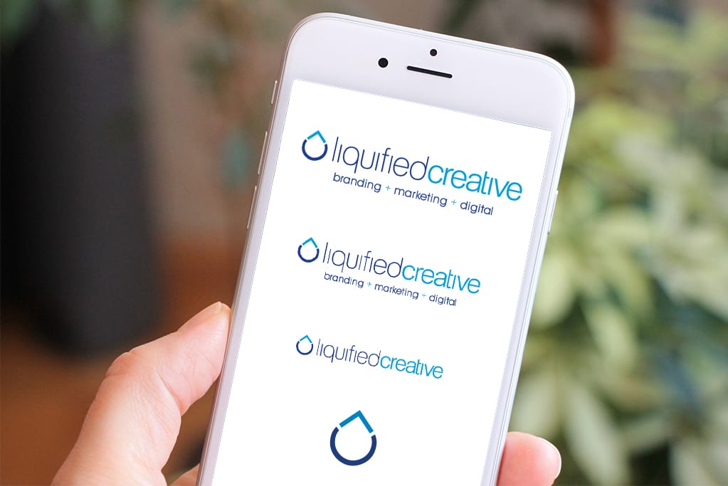
To avoid distortion and loss of integrity within responsive websites, it’s important your logo is designed with responsive frameworks and variable sizes in mind—not just resized to fit the available space. It has to look great and remain legible across a range of sizes. The most adaptable logos are simple and flexible, with varying formats and layout options so that when a site is optimized for a device, the brand is also optimized to the space allocated for it.
Some things to consider:
- Keep it simple—simple logos are scalable without losing important detail. In responsive web design, the inability to scale cleanly will become very apparent.
- The most flexible logos can stand alone as a recognizable symbol or icon; dropping the wordmark altogether in situations where space is limited.
- Flat design (the lack of shadows or other special effects that emphasize dimension) and sans-serif fonts are generally more web-friendly.
Industry leading brands such as Twitter, Facebook, Spotify, and Google have all refined and simplified their brands for the growing mobile market. Their logos today are prime examples of versatile solutions to considering your own brand and how to optimize your logo to thrive within responsive web design.