News
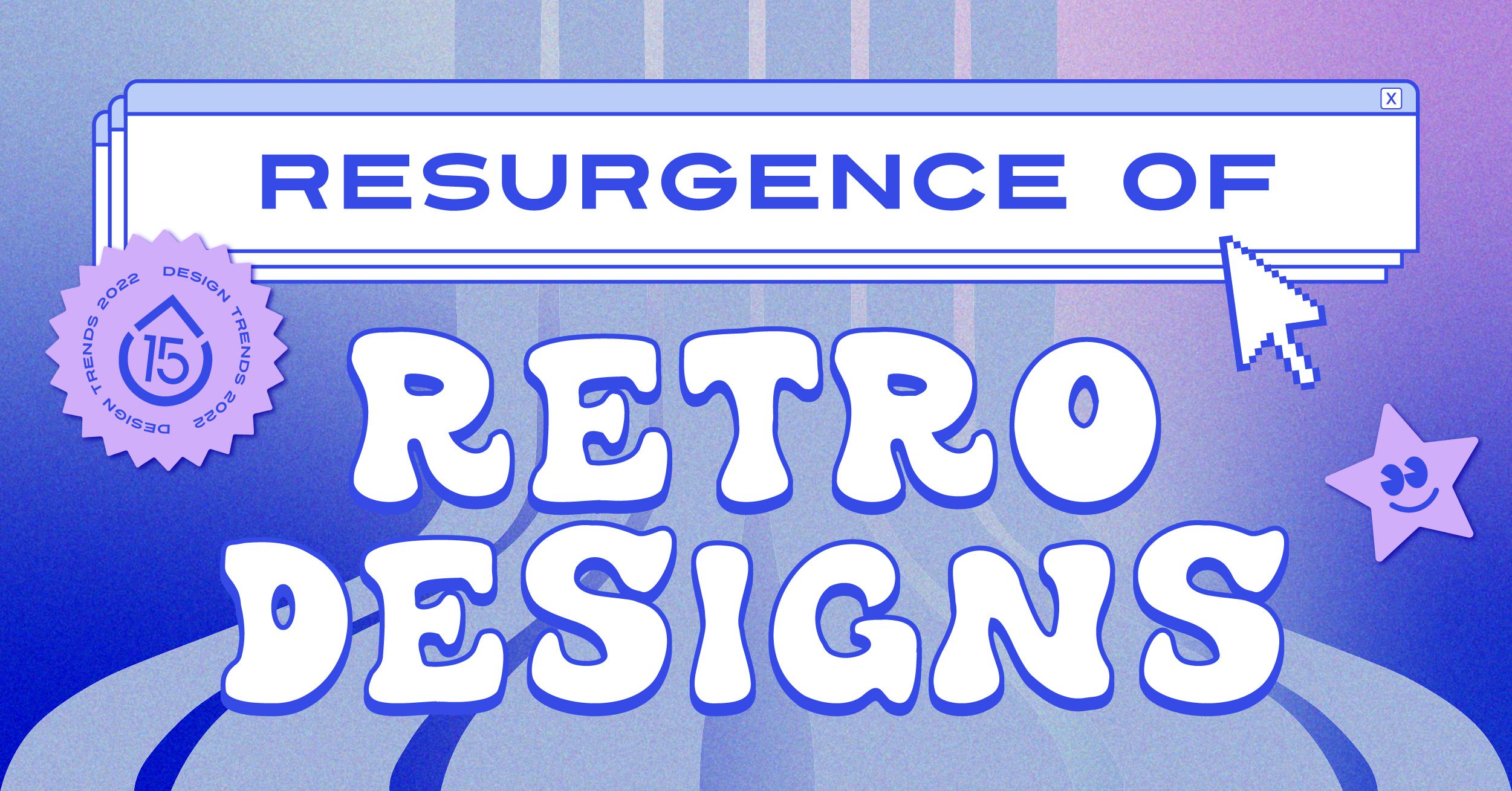
Design Trends in 2022: Resurgence of Retro
When refreshing a logo or designing a brand from scratch, there are important factors that designers must consider when going through the creative process, such as what’s trending at the time and will its impact be lasting?
A top goal for most creatives is whether the work they’re producing is attention grabbing. Who is the target audience and what works when it comes to grabbing their attention? With the rise in social media apps like TikTok and Instagram Reels, hooking someone’s attention must be immediate and engaging.
2022 has already seen a multitude of different design trends take the spotlight, such as futuristic and grainy textures to accent the visual impact of a design. While a new fad seems to pop up every other week, one style has stood out to our creative team in particular: the resurgence of retro design themes.
This isn’t the first time this has happened, and it’s no surprise that there’s a resurgence in the nostalgia theme throughout various design trends. Nostalgic elements come into play through colors, fonts, and formats that drive to unlock core memories in a person’s mind. For example, take the stencil font used for the M*A*S*H logo or the 90s/Y2K gradient styles and color palettes heavily based on vibrant purples, greens, reds, and rich blues. People yearn for the fondness of simpler times “back in the day” (especially pre-pandemic life), which is why retro themes have seen an increase in popularity.
Design isn’t the only industry that’s been affected by this retro revival. In the gaming industry, Nintendo has resurrected games like Super Mario 64, Lego Star Wars, and Mario Party – all well over 15 years old – to appeal to a new, younger audience and attract an older one that grew up playing them. Change is a constant in our lives and nostalgia is an emotional element that helps reunite us with our past selves and provide a constant comfort amongst the chaos.
There are two eras that we want to focus on here: the 60s/70s flower child era and the 90s grunge/fluorescent colors. The 60s and 70s “groovy” themes have seen a resurrection this year in designs utilizing vibrant colors and funky fonts. In comparison, 90s elements like loud typography and abstract patterns appeal to an ever-increasing audience of Millennials and Gen Z-ers. (Maybe it has something to do with the fact that it’s the 25th anniversary of the first Austin Powers movie?)
Our team has even employed these retro design trends in some recent work for our clients. When designing the new creative theme for the Annapolis Pride Parade & Festival, we utilized retro elements to emphasize a feeling of acceptance, love, and community.
When designing visual elements for Elizabeth Seton High School’s social media brand aesthetic, we turned to the 90s for design inspiration and landed on illustration-based stickers. These stickers capture the trend of what is popular right now, especially across social media, to appeal to current and future students. By capitalizing on these retro trends, we have been able to successfully appeal to the various target audiences through the commonality of nostalgia.
Earlier this year, we created a design for the Brief Club, an Instagram-based community that shares a different prompt each week for graphic designers to take a stab at. This particular one focused on a retro-themed design for a flower shop. Our creative team utilized a 1970s aesthetic that married flowers and love and heavily embodied the “flower power” theme of the era. Check out the final product here.
Last but not least, to celebrate our company’s 15th year anniversary, we decided to capitalize on the retro resurgence by revamping our logo and overall brand aesthetic, particularly on social media. As a company, we felt that the Y2K design trend best captured our company’s energetic personality. When we first talked about a brand refresh, we brought up a lot of popular brands that caught our eye, like LoverBoy Spritz and Hard Teas and Alani Nu Energy. These brands use elements of the Y2K design aesthetic, such as bright colors, vibrant typography, and gradient-style images that really evoke that feeling of nostalgia.
Do you think that retro designs will continue to take the spotlight in upcoming years? Let us know.