News
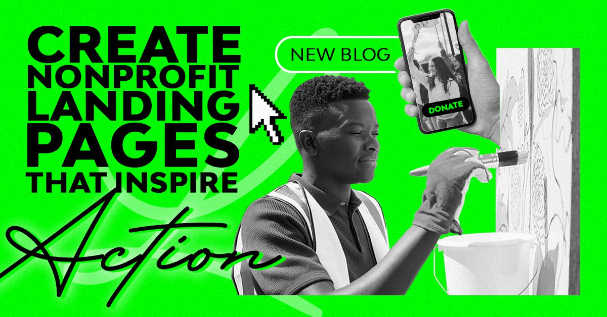
Igniting Impact: How To Create Nonprofit Landing Pages that Inspire Action
Have you ever landed on a nonprofit landing page that was so confusing you didn’t know what to do next or what the page was even about?
These nonprofit landing pages, specifically those geared towards fundraising and donations, are frequently one of the most overlooked places to seal the deal with a donor. If that page is too short, long, boring, or confusing, there’s no transaction – it’s that simple. Your fundraising landing page is a perfect opportunity to make a strong connection with a donor, and that strong connection is what motivates people to give.
This blog is your first step in crafting a donation page that will not only build trust and engagement but also inspire donors to come back again and again. Together, we’ll examine the elements of a frictionless donation page that stands out from the crowd and gets results.
The Setup
When a user lands on your nonprofit’s donation page, the action you want them to take should be very obvious. Let’s start by going over some of the essential structural elements of a great nonprofit landing page. You’ll want to start with a headline, followed by your subheadline, then the main body of text, and finally, the call to action.
The headline is the first thing a potential donor should read, so it needs to be big, bold, and easily seen. Try to craft something with a little punch that will draw the user in and keep them interested.
As far as your subheadline, you could reference your organization’s tagline, a concise and compelling summary of your mission statement, or immediately counter an objection. Here, you should clearly communicate the purpose and impact of your nonprofit or the justification of the need.
Moving onto your main body of text, be sure to use concise, jargon-free language, which will help make your content easy to read. Stay hyper-focused on your goal and get to the point as quickly as possible. Both your youngest and your oldest supporters should be able to understand your appeal.
Your call to action also needs to be obvious. For example, if you’re asking for donations, it could be something like ‘Give Today’ or ‘Donate Now.’ If you’re selling tickets, tell your audience to ‘Purchase Tickets’ or ‘Reserve Your Spot Today.’
And – remember – stick to one call to action whenever possible. Research shows that, when presented with more than one option, people are more likely to pick the less expensive one. So, if you ask someone to donate or join your email list on the same page, they will be more likely to pick signing up for emails.
The Design + Functionality
While your messaging is important, we can’t forget the visuals. Your compelling text should be accompanied by visually appealing imagery that tells a story, evokes emotion, and establishes a connection between your cause and the visitor. If you don’t have your own brand imagery, try to select stock photography that shows the outcome of what your organization does.
When it comes to layout and design, you’ll want to keep a few key concepts in mind:
- Create visual hierarchies. The inverted pyramid, one of the classic guiding principles for readability, emphasizes the value of putting important things first. Place the essential things that you want your visitors to see at the top of the page. Try combining this with something called “gaze following.” In short, “gaze following” means we’re more likely to look at what other people are looking at, even if it’s a photograph with the subject’s line of sight aimed at a significant section of text.
- You’ll also want to be sure you’re following accessibility guidelines, such as using an 18-point font, adding alt text in images for screen readers, using contrasting colors, and more. Your web designer should be checking accessibility during their design process. If you’re building this page on your own, try using a free online tool such as Accessible Web.
- You’ll also need to make sure that your landing page is responsive. It’s essential for users to be able to digest all of your content easily from any device. If your website isn’t mobile-friendly, you’re going to be missing out on a lot of conversions.
- Beyond just employing the basic principles of design, try also utilizing various engaging elements on your landing page, such as video, case study previews, progress indicators, and maybe even some color psychology.
The Donation Process
The goal is to encourage donations, so why not streamline the donation process? Minimize the number of steps required, provide multiple payment options, and clearly communicate the value of each donation.
When the donation process involves filling out a form, you should ensure that the form is as quick and easy to fill out as possible. Gather only the information that you need, such as name, email, and payment info for donations. Your audience is much more likely to complete a conversion if they don’t have to spend a lot of time on your form. When it comes to accepting donations, consider providing users with digital wallet payment options. Apple Pay, Venmo, Google Pay, or PayPal – these options allow them to fill out your form in just a few clicks.
Follow your smooth donation process up with a warm thank-you page – this will increase repeat donors.
Also, please don’t offer other ways to give that conflict with your call to action. Mention other programs elsewhere, maybe on a “Ways to Give” page or even on your Thank You page, but keep your donation page focused on ONE thing – donating.
Furthermore, tracking and measuring are essential to creating an effective nonprofit landing page. For example, if your main goal is to raise funds, you need to be tracking, at the very least, revenue coming in, the number of donors, and the average donation per donor. You can also take this the extra mile and track the form fill rate. This metric is referring to the percentage of people who come to your site and complete the donation as opposed to the percentage of people who begin the donation form but never complete it.
Let’s Get Your Nonprofit Donation Page to Perform
There are more and more barriers that keep donors from giving, and your nonprofit donation page shouldn’t be one of them. Your donation landing page should help you achieve your nonprofit goals and nurture website visitors into long-lasting, engaged supporters.
Remember to keep your landing page content up-to-date, reflecting the latest achievements, campaigns, and events. You can also regularly test different elements, such as headlines, images, and CTAs, to optimize conversion rates (which is why data tracking is so important).
If you need help optimizing your nonprofit’s donation landing page or creating various landing pages for different donation campaigns, don’t hesitate to reach out!