News

Logo Design Trends: Monoline

When it comes to creating brand identities, any designer will agree there isn’t one single recipe on how to design the “perfect” logo. As well as being influenced by a company’s message and products, designers also have to factor in the trends that develop and evolve year-to-year.
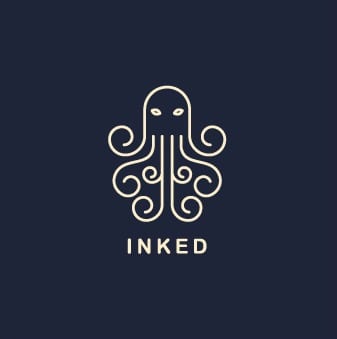
As brands are continuously competing to capture consumers’ attention, designers today are incorporating elements of typography, geometry, and negative space into their work. One of the most prolific trends we’re seeing is the use of single-weight, wire-like line work utilizing typography and illustration. At first glance, this logo design style seems to run against the idea of simplification because of the intricacy of its execution. A deeper look, however, presents a clean, clear, and refreshingly honest aesthetic with a hint of handmade. Furthermore, this versatile style can be adapted to be minimal or complex, vintage or modern, fancy or casual. The monoline style presents a welcome break from all the colors and gradients used in a majority of logo designs.
Monoline logos are an ode to iconography and an increasingly relevant strategy now that emojis and memes dominate the web. Quick and to-the-point, using a single, continuous line to swerve, tip, and twist its way into a memorable shape, crest, or another combination mark is a time-tested tool for designers.